


Jessica Lang Design
Project: Package Design
Student Project: Portfolio Development
Disciplines: Illustrator, InDesign, Photoshop
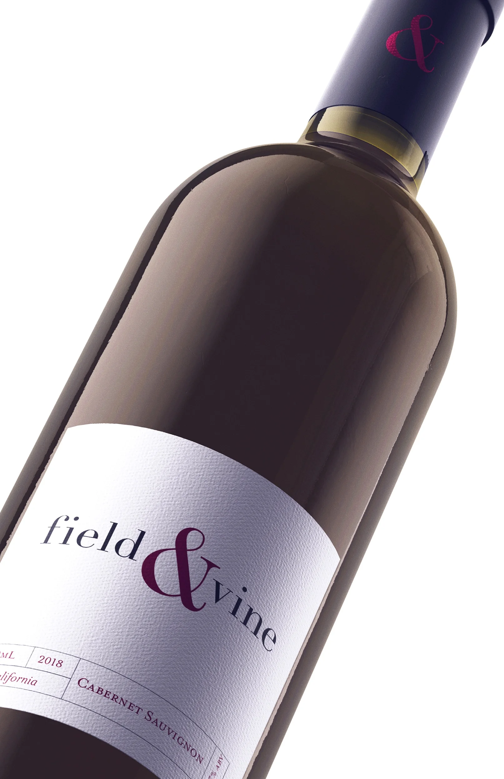
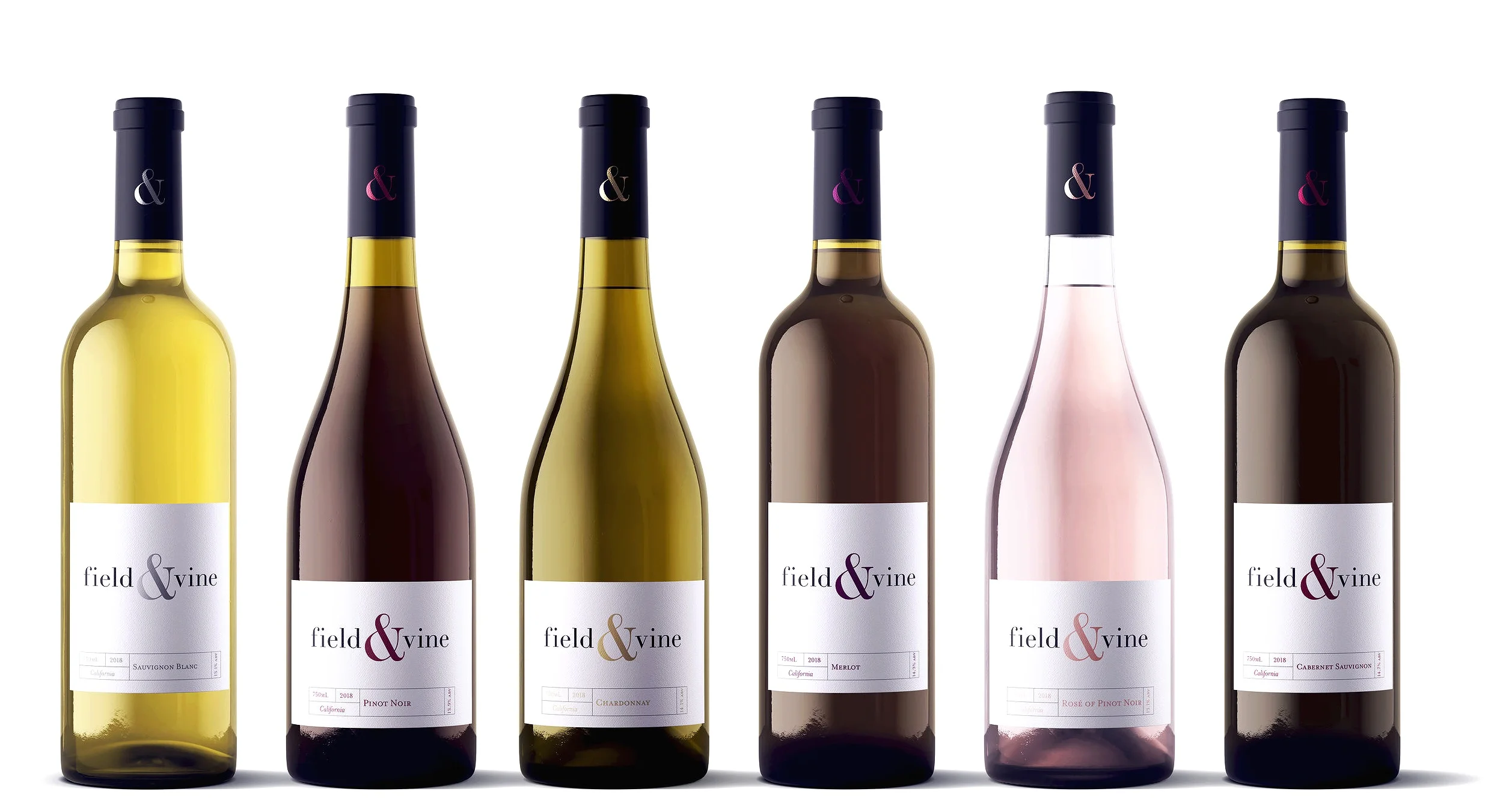
Description: Field & Vine is a premium wine brand created to showcase the top varietals of California wine country. Sophisticated, simple and clean, the brand is designed to appeal to the informed wine consumer looking for an elevated experience of the true expressions of California’s varietals.
Typeface selection was very important as it is the focus of the design. The ampersand style of the typeface was of particular importance as I specifically wanted the enclosed, modern style “&”. I selected a sophisticated serif typeface for the logotype and used only lowercase letters to bring an element of approachability to the design. For the vintage, varietal and legalities I used a serif typeface comprised of all small caps to balance the lowercase logotype.
The color pallet was designed to differentiate the varietals from one another visually while also being a natural fit for the wines. Shades of red relative to the wine style were used for the red varietals, ranging from a dusty burgundy for the Pinot Noir to a deep crimson for the Cabernet Sauvignon. To maintain the sophistication of the brand, I avoided the typical yellows, blue greens and pinks used for Chardonnay, Sauvignon Blanc and Rosé and instead selected metallic foil. A gold foil for Chardonnay, silver for Sauvignon Blanc and rose gold for Rosé. The white textured label has a high end, premium feel while the black capsule showcases the brand signature, the ampersand.
Project: Package Design
Student Project: Portfolio Development
Disciplines: Illustrator, InDesign, Photoshop
Description: Field & Vine is a premium wine brand created to showcase the top varietals of California wine country. Sophisticated, simple and clean, the brand is designed to appeal to the informed wine consumer looking for an elevated experience of the true expressions of California’s varietals.
Typeface selection was very important as it is the focus of the design. The ampersand style of the typeface was of particular importance as I specifically wanted the enclosed, modern style “&”. I selected a sophisticated serif typeface for the logotype and used only lowercase letters to bring an element of approachability to the design. For the vintage, varietal and legalities I used a serif typeface comprised of all small caps to balance the lowercase logotype.
The color pallet was designed to differentiate the varietals from one another visually while also being a natural fit for the wines. Shades of red relative to the wine style were used for the red varietals, ranging from a dusty burgundy for the Pinot Noir to a deep crimson for the Cabernet Sauvignon. To maintain the sophistication of the brand, I avoided the typical yellows, blue greens and pinks used for Chardonnay, Sauvignon Blanc and Rosé and instead selected metallic foil. A gold foil for Chardonnay, silver for Sauvignon Blanc and rose gold for Rosé. The white textured label has a high end, premium feel while the black capsule showcases the brand signature, the ampersand.